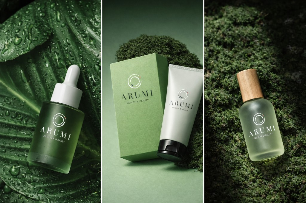
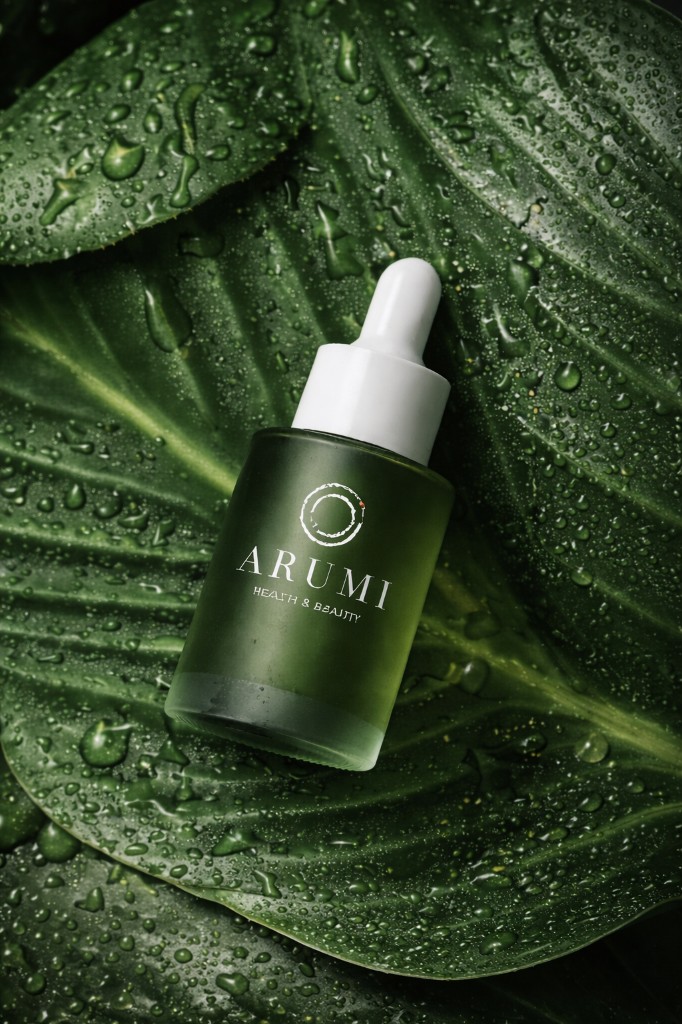
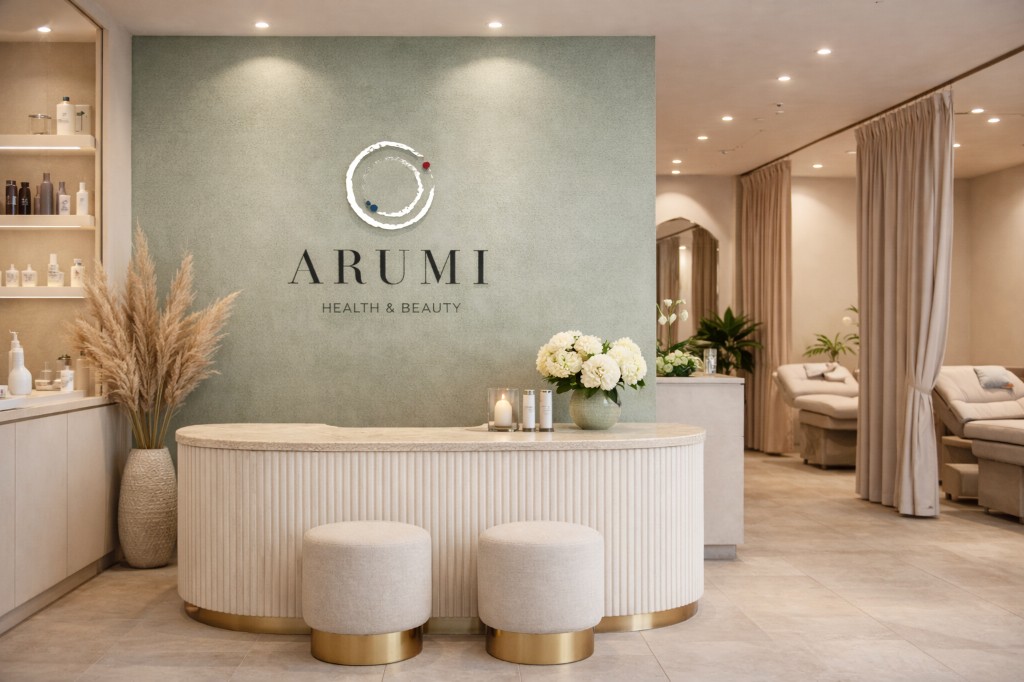
Arumi
This rebranding project reimagines Arumi, a South Korean beauty salon, through a more timeless and contemporary visual identity.
While maintaining subtle links to the original flag-inspired branding, the new direction moves towards elegance, restraint, and balance.
The concept draws from current Korean beauty trends, where purity, simplicity, and visual harmony play a central role.